

Keep the great outdoors where it belongs.
The proper seal for windows and doors.
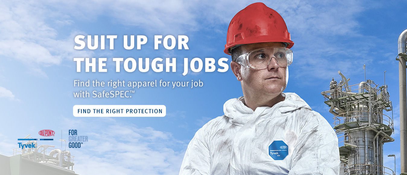
Hero List Component
Hero list component is used to display the Hero image with different views in the page, so that it will be more appealling and attractive to the customers. Below are the views currently using as per the DuPont brand guidelines.
The proper seal for windows and doors.
Quickly and cleanly apply airtight, water-resistant seals between framework and rough openings
The pesticide-free way to protect your home.

Sure up your defenses while providing an extra layer of comfort at the points of entry around your home
From the basement up, we’ll help you seal the deal.

Check out how simple it is to turn any basement into a more comfortable place to call home.
The all-in-one kit for professionals.

The fast way to fill gaps in rim joists and roof wall junctures.
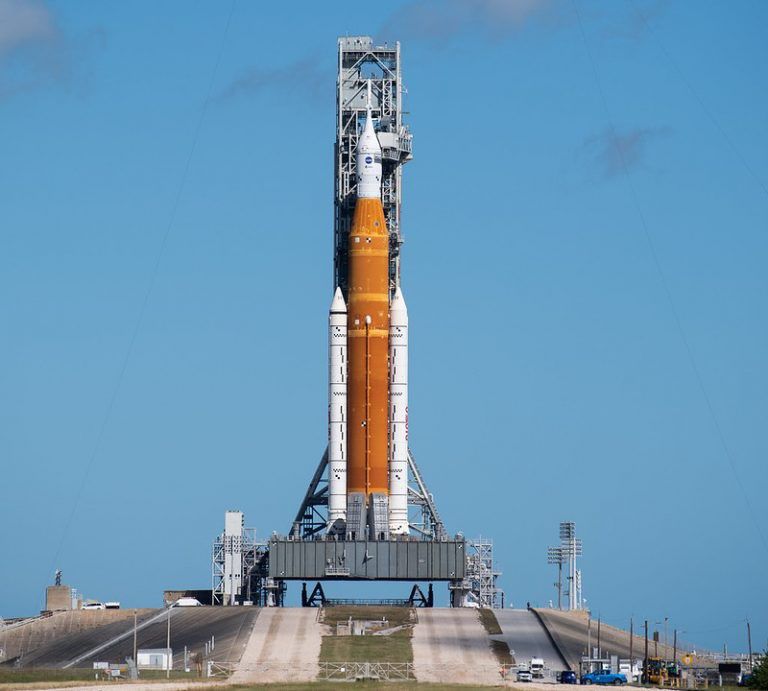
On November 16th, NASA successfully debuted its Space Launch System (SLS) rocket and the Orion capsule with a long-awaited launch from Kennedy Space Center, for what will be a more than month-long journey around the Moon. And as was the case for the first missions to the Moon, DuPont™ Kapton® polyimide films are onboard.
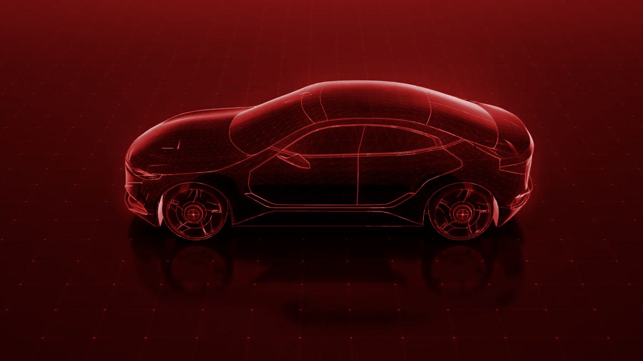
Autonomous driving and electrification are transforming mobility and creating high-stakes interconnect challenges for automotive manufacturers. We invite you to visit our applications-focused destination describing how DuPont Interconnect Solutions is supporting the reliable operation of next-gen automotive interconnects.
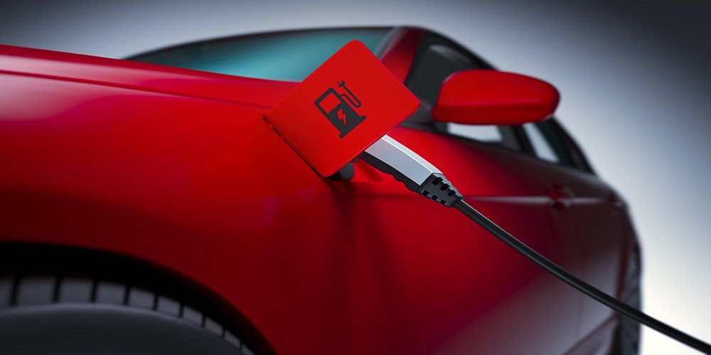
DuPont (NYSE:DD) Interconnect Solutions, part of the Electronics & Industrial business, announced today a multiyear contract with European power module manufacturer Semikron-Danfoss who will integrate DuPont™ Pyralux® AP all-polyimide double-sided copper clad laminate into its eMPack® power modules to further enhance the capabilities of next-gen electric vehicles.
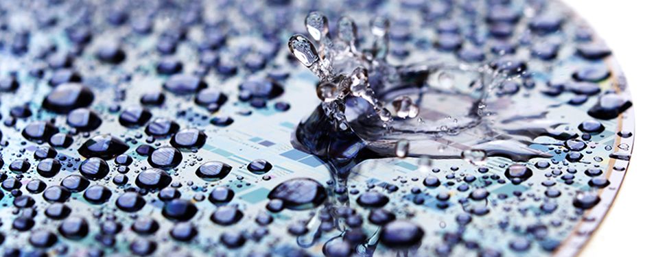
DuPont’s PCMPSolv™ family performs advanced post-CMP cleaning with safer-by-design, green chemistries.
In Carousel Text Background view the background can be changed according to the dupont brand guidelines.
Please find the below recommended image sizes for each view .
| View | Size |
| Carousel Text Background view | 537x530px |
| Remaining all the Views | 1440x700px |
Reference URL's: