Breadcrumb
This Component is used to display the timeline.
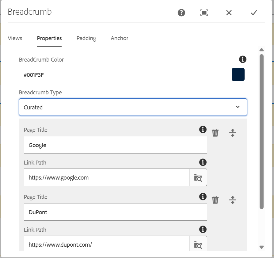
Breadcrumb Dialog

Dialog contains:
Views: This component has 2 views
- Default View
- Corporate View
Image: We need to give the content path of the image that need to be displayed. Dimensions of the image should be 650*650
Side Scroll Items: We can add "N" number of items that need to be displayed based on the requirement by using add option.
Title: Side scroll item title.
Link: It contains URL . When we click on the content it will be redirected to the Url which is authored. If not required, we can give # in the field.
Description: Side scroll item description.