Action Bar Component
By this component, we can display the social media platforms in the pages through which the information can be shared.
The functionality of this component is that it will appear at the top of the page when we scroll down.
View:This Component will have one view - Action bar view.
Dialog contains:
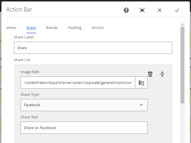
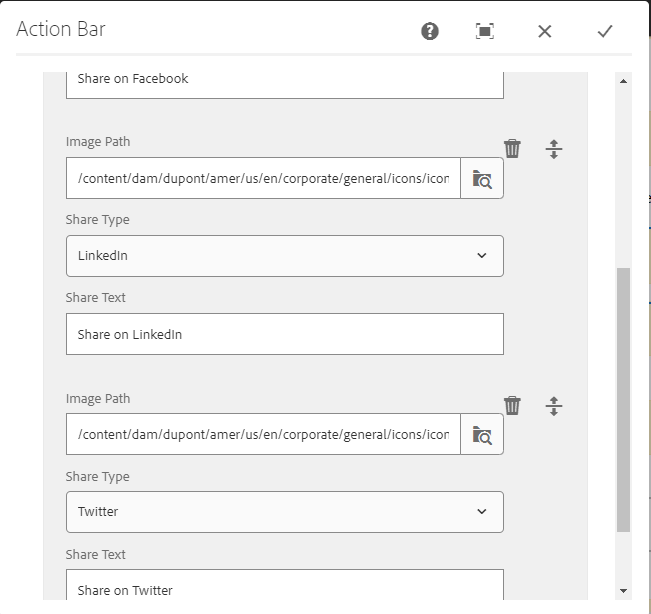
In the dialog the Share label can be given like Share. And in the share list by clicking on add option we can add different social media platforms.
Image path: This field is used to configure the image of the social media icon to be displayed.
Share Type: In this field there will be drop down available in which we can select the social media platform from the following (Facebook, Twitter, LinkedIn, Wechat, email).
Share text: This field is used to give the text to the social media platform, while we click on the icon the text which we gave will be dislplyed there. For example (Share on Facebook)
Brands:
Brand Heading: We can author the main heading that needs to be displayed on the page.
Brands List: In this the Brand title and page path can be authored.
Action Bar component dialog


View of Action Bar Component
The functionality of this component is that it will appear at the top of the page when we scroll down.
Important Information:
- The social media platform can be selected from the following (Facebook, Twitter, LinkedIn, Wechat, email) under share type drop down.
- Brands can be updated based on the requirement.
- Live URL: https://www.dupont.com/building/exterior-walls.html